Brand
- Docs updated
Australia’s ticketing partner
Oztix is Australia's largest independent ticketing company. These pages are for designers, agencies, and partners making anything that carries the Oztix brand, such as posters, social posts, emails, decks, and print.
Roadie is where the brand meets code. The brand's colours are Roadie's colour scales, its type is Roadie's text styles, and its spot illustrations are Roadie components, so a design and the app it becomes share one source.

How the brand comes together
Every piece builds from the same five steps, in this order.
| Step | What it means |
|---|---|
| 1. Colour sets the stage | Sit on white, a light neutral, or a house colour. Spotlight blue is for small, concentrated moments, and the ground under the pattern. |
| 2. Type carries the weight | Bold Intermission headings in sentence case lead, often in a house colour block. Lighter weights carry the rest. |
| 3. Illustration or pattern adds texture | Most pieces use one or both, scaled to sit with the heading rather than compete with it. |
| 4. Photography grounds it | Real events, real crowds, and real moments. |
| 5. The logo anchors it | Place it last, the primary logo with the tagline wherever there's room. |
A typical layout
Colour, bold type, and an illustration or the pattern together are the signature. Leave one out and the work feels unfinished.
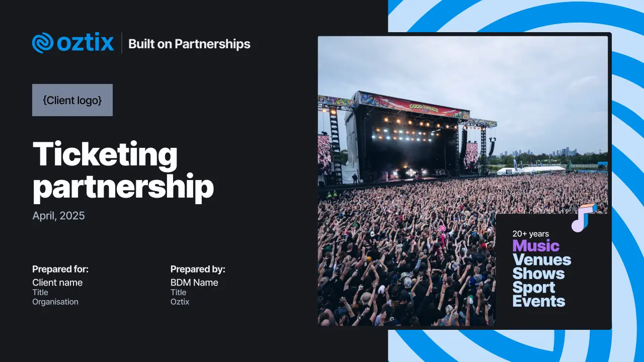
- A neutral or house colour background.
- A bold Intermission heading, often in a house colour block.
- An illustration or the pattern, scaled to sit with the heading.
- One main idea, supported by minimal copy.
- The Oztix logo, with clear space around it.
Tone
Oztix sounds like an experienced partner, not a corporate vendor. Write in sentence case and Australian English, keep it active, and cut the filler, as Voice and tone sets out.
In Roadie
- The brand colours are the
intent-brand-blue,intent-brand-purple, andintent-brand-orangeintents, set out on Colours, and the--color-brand-blue-*,--color-brand-purple-*, and--color-brand-orange-*tokens. - Intermission and its text styles are on Typography.
- The logo is the Logo component, and the swirl pattern the Pattern component.
- The spot illustrations are the SpotIllustration components.